
Best Mobile Website Design Techniques With Examples

By Melissa Ng | Last Updated 1 April 2024
Adopting A Mobile-First Mindset
Why Is Mobile Such A Big Deal?
Have you noticed that everyone’s always on their phone? It’s more than just a trend – it’s a huge shift in how we use the internet.
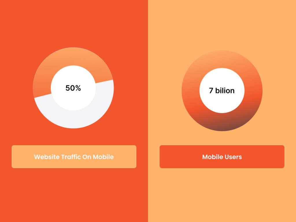
These days, more people surf the web on their phones than on computers. In fact, over half of all website traffic now comes from mobile devices [1]. And guess what? This isn’t slowing down anytime soon.
By 2024, we’re looking at over 7 billion mobile users [2]. That’s a lot of scrolling and tapping!
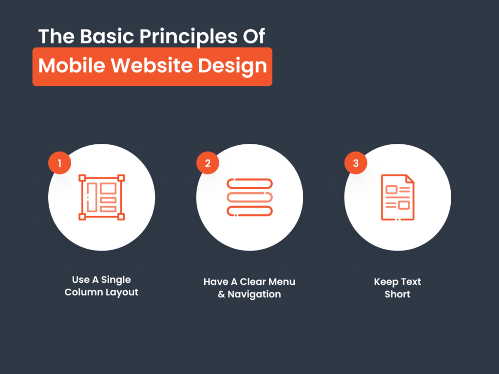
The Basic Principles Of Designing For Mobile Websites
When it comes to making sites that work great on mobiles, there are a few key things to remember – it’s all about making the experience easy and enjoyable for the user.
- Keep It Simple: Aim for a single column layout. It’s the best way to lead users through your site smoothly, from top to bottom, without them having to zoom in and out to read your content.
- Easy Navigation: Your mobile menu should be easy to spot and use, with big buttons that anyone can tap without a second thought, and a navigation bar that’s always within reach.
- Clear Communication: On a small screen, less is more. Avoid cramming in too much information. It’s not the place for lengthy explanations. Instead, be clear and get straight to the point. You want your message to be easily understood at a glance.
Get Flexible With Responsive Layouts
How To Make Your Website Fit Every Screen

Here’s what you need to know to make a site that adapts to any screen size.
- Use fluid grids: Stretchy, fluid grids are the foundation of responsive design. They work like elastic, adjusting your website’s layout to fit the screen it’s viewed on perfectly.
- Learn to rely on media queries: These are bits of CSS code that check the screen size of the device viewing your site and then apply the right style so everything looks just right.
- Make sure your images can adapt: Your images should be able to scale up or down without losing quality. This means no matter the device, from the smallest smartphone to the largest tablet, your visuals stay sharp and clear. Check out our blog post for more information: Optimise Website Images: Quick Compress & Optimize WebP & JPEG.
Examples Of Awesome Responsive Web Design
Let’s look at a couple of examples that show off how websites can adapt smoothly across different devices.
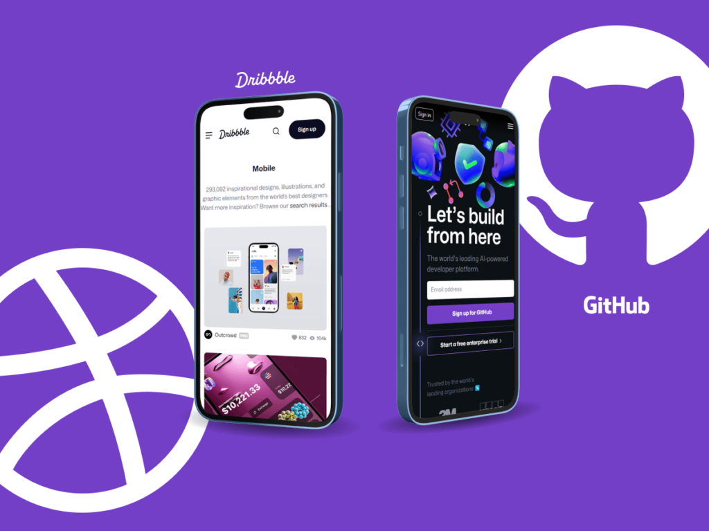
Dribbble: Known for its creative community, Dribbble’s site uses a flexible grid that shifts its columns depending on the desktop or mobile view. To avoid a cluttered look on smaller screens, Dribbble tucks its menu behind a hamburger icon.
GitHub: GitHub keeps things smooth and easy to use, no matter what device you’re on. This smart design makes sure everyone can use GitHub easily, showing how important it is to think about the different ways people visit websites.
Speed Optimisation: Tips To Make Your Site Load Fast
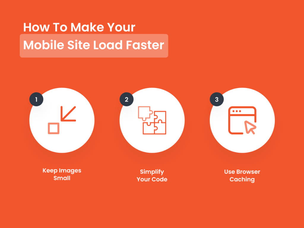
How To Make Your Mobile Site Load Faster
If you want your mobile site to load quickly, here are some easy steps to help speed it up:
- Keep Images Small: Big pictures take longer to load. Make sure your images are small so your site can open faster.
- Simplify Your Code: Use tools and plugins to help minimise your CSS and JavaScript code. This makes your site lighter and faster.
- Use Browser Caching: This helps browsers remember your site and load it faster the next time someone visits.
We’ve got even more tips in our blog post: Speed Up Your Site: Essential Tips On How To Improve Website Page Speed.
Examples Of Super Fast Websites
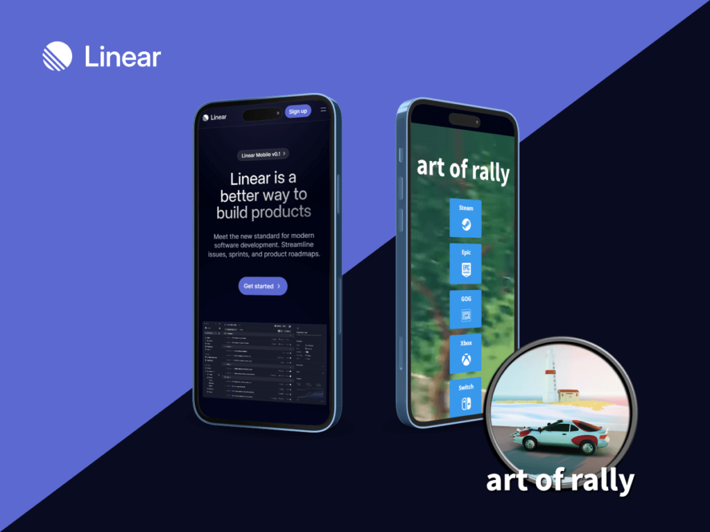
Here are a couple of examples showing how some websites really nail the fast loading game.
- Linear: This tech company has made their mobile site super quick and easy to use. They keep things simple and clean, making sure everything loads fast and navigation is easy. Right from the start, it’s obvious they’ve focused on making everything from tapping to scrolling quick and smooth.
- Art Of Rally: Even though gaming sites usually have lots of heavy graphics, this one stands out by being quick to load. It offers cool graphics and quick load times, all thanks to optimised images and well-managed content. It’s all about making things fast without losing any of the cool visuals.
Easy Navigation & Access To Guide Users
Making Easy-To-Use & Thumb-Friendly Navigation
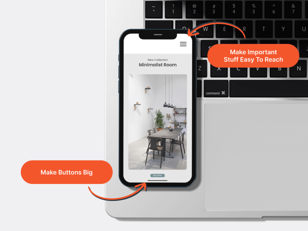
When designing your mobile site, it’s important to make it easy for people to get around with just their thumb. Here are some tips:
- Make Buttons Big: You want your buttons to be easy to see and tap on.
- Put Important Stuff Where Thumbs Reach Easily: Think about where your thumb naturally goes on your phone. That’s where you want to put the important stuff like menus or buttons. It’s like placing everything right where you need it, without having to stretch your hand awkwardly.
Examples Of Good Mobile Navigation
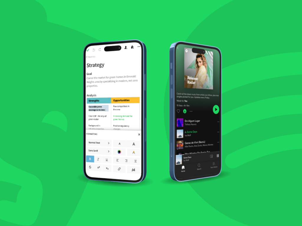
Let’s take a look at some good mobile sites that guide their users with smooth navigation.
- Spotify: Their app gets how you use your phone. Everything you need, like your homepage, search, or library, is right there at the bottom where you can easily tap your thumb.
- Evernote: This easy-to-use digital notebook has got buttons that are easy to find for doing things quickly. A simple menu, and a button you can always see for making a new note. It makes using the app both easy and quick.
Clear & Simple Design Is Powerful
Keep Mobile Web Design Minimal
Keep it super simple on your mobile site. Here’s why less is definitely more:
- Leave room for empty space: Blank space helps everything look clearer and lets your users’ eyes take a little break.
- Only keep what you really need: If something on your site doesn’t have a clear job, it’s just getting in the way. Stick to the essentials to keep your site focused and easy to use.
Websites That Are Clear & Simple
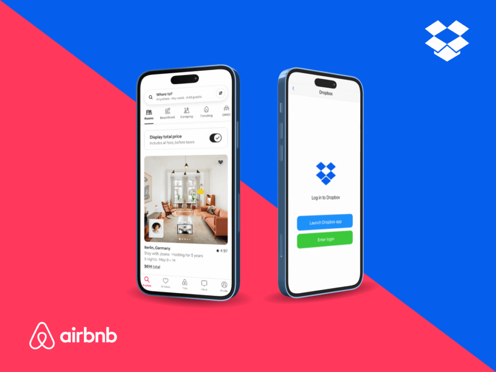
Check out these websites that really know how to make an impact with their visuals, all while keeping things beautifully simple.
- Dropbox: Their mobile site uses lots of space, bold images, and short text to talk to you clearly and quickly. It’s all about making things easy to understand at a glance.
- Airbnb: This site grabs your attention with beautiful pictures of places you’d love to visit. It’s clean layout makes finding and booking your next adventure straightforward.
Make Your Site Fun With Interactive Elements
Using What Your Device Can Do To Enhance Your Site
Your mobile device is packed with tools that can be used creatively in web design. Let’s take a look at a few examples:
- The Camera: Allowing customers to use their camera to virtually try on sunglasses is both fun and practical.
- GPS: Your location can give spot-on suggestions for places to eat right when you’re feeling hungry.
Making Text Easy To Read On Small Screens
Tips For Choosing & Sizing Fonts
When choosing fonts for your site, aim for clear fonts that match your branding.
- Fonts: Fonts that are clear and straightforward, like Arial or Helvetica, are reliable and make text easy to read in various situations.
- Font Size: Start with 16px for mobile screens. This size is generally the best for making text clear without being too large. However, it’s not a one-size-fits-all rule. Try it out on your own device, see how it looks, and adjust as needed until it’s perfect.
Websites With Good Text Readability
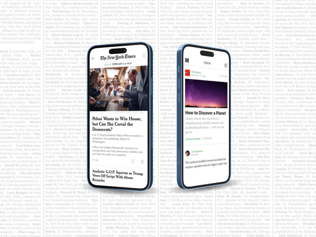
Let’s talk about a couple of websites that make reading on a phone enjoyable because the text is clear.
- Medium: Reading there is easy and comfortable, with text that’s sharp and spacing that lets your eyes relax.
- The New York Times: This site mixes old-school trustworthiness with a clear and easy-to-read style. It shows that even traditional newspapers can look great on a mobile screen.
Making Buttons That Get Clicks
How To Design Click-Worthy Buttons For Mobile
The perfect call-to-action (CTA) needs to grab attention. Here’s how:
- Get The Sizing Right: The button should be easy to tap but not so big that it messes up your site’s look. Aim for something that feel right under the thumb.
- Make It Pop: Choose a colour that stands out but make sure it still looks good with the rest of your site’s colours, so it doesn’t look out of place.
Successful Mobile CTAs
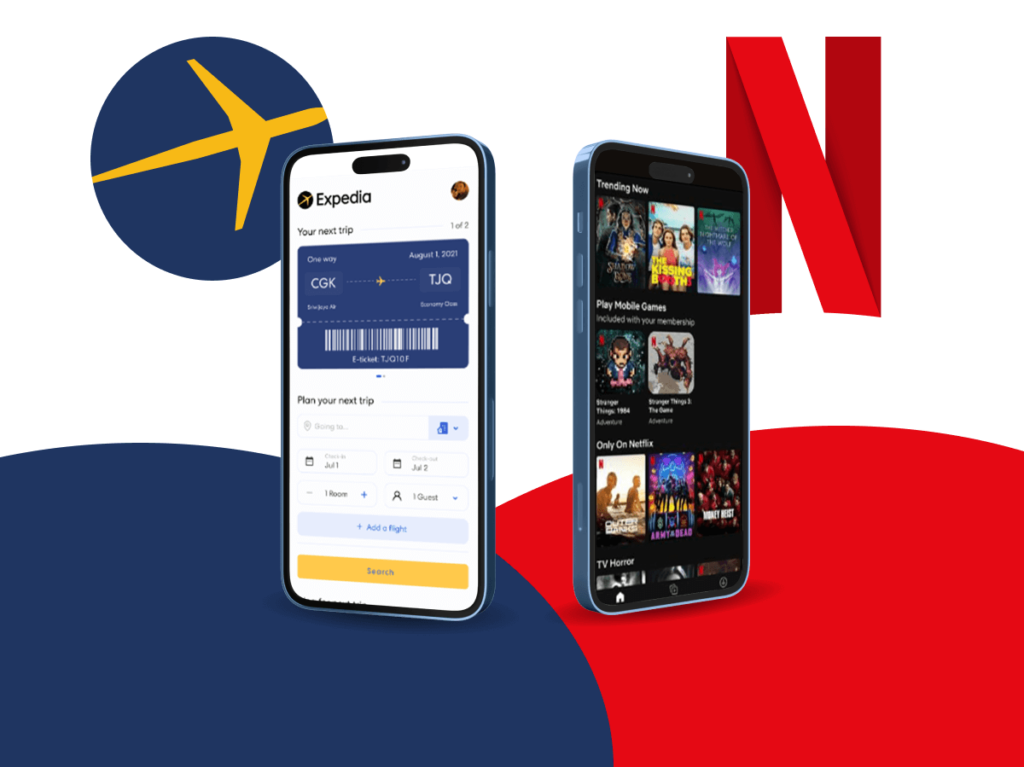
Check out how these mobile buttons grab your attention and make you want to click.
- Netflix: Netflix’s big, bold “Get started” button invites users to sign up and start their next binge-worthy series. A big red button is hard to miss.
- Expedia: Expedia’s large blue search button invites you to your next adventure. This blue button is clear on the white background, so you won’t miss it.
Frequently Asked Questions
Why is mobile-first important?
Designing with a mobile -first approach is important because it puts the needs of smartphone and tablet users first. Since more and more people are using these devices to browse the web, focusing on mobile help you read a bigger crowd.
Plus, Google prefers websites that are optimised for mobile, which can boost your site’s ranking in search results.
What Makes A Website Mobile-Friendly?
To make your website mobile-friendly, here are some steps to follow:
- Use Google’s Mobile-Friendly Test: It’s a check-up to see if your site is ready for mobile visitors.
- Adjust Buttons & Spacing: Ensure all buttons are easy to tap without accidentally hitting the wrong thing.
Sources
[1] Statcounter GlobalStats: https://gs.statcounter.com/platform-market-share/desktop-mobile/worldwide/
[2] Ericsson: https://www.ericsson.com/en/reports-and-papers/mobility-report/mobility-visualizer


Submit An App
Seen a cool app you think we should review? Submit your recommendation using our form.