
Optimise Website Images: Quick Compress & Optimize WebP & JPEG

By Melissa Ng | Last Updated 11 March 2024
Introduction to Image Optimisation
The Essentials of Website Image Optimisation
Optimising images is a pivotal step in website development that directly impacts its speed, user engagement, and SEO ranking. The art of image optimization lies in striking the perfect balance between maintaining visual quality and minimising file size. This involves choosing the right format (JPEG for photos, PNG for graphics with transparency, and WebP for a modern balance of quality and compression), compressing images without significant loss of clarity, and resizing them to fit the context in which they’re displayed.
Tools like TinyPNG, Adobe Photoshop, and WordPress plugins such as Smush and Imagify make this process accessible, allowing for efficient compression and format conversion. By embedding optimized images, websites can load faster, consume less bandwidth, and offer a smoother user experience, ensuring content not only captivates but retains viewers’ attention in the fast-paced digital landscape.
WebP and JPEG: Understanding the Formats
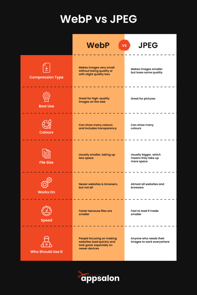
WebP and JPEG are two of the most common image formats on the web. Understanding their characteristics can help you make informed decisions about optimising your website’s images, particularly when it involves managing your disk space efficiently.
JPEG is almost synonymous with web images, having been around since the early days of the internet. This format is best for photographic images and offers a balance between image quality and file size through lossy compression. This means some data is lost during compression, which might result in a minor reduction of image fidelity.
One of the great benefits of the JPEG file type is the ability to choose the level of compression that you would like, directly affecting the compression rate and the final disk space consumed. Incorporating lossy compression techniques during image optimization work can significantly reduce file sizes while maintaining a balance between quality and disk space usage.
Top 5 Features of JPEG:
- Widely supported and recognised format for ease of use.
- Ideal for photographs and complex images with rich colours.
- Offers a balance between quality and file size through adjustable compression rates.
- Supports a high range of colours to carry vibrant imagery.
- Fast loading times for optimised files, provided that a reasonable compression rate is chosen to balance quality and performance. When incorporating an image optimisation workflow, considering the use of lossy compression technique is essential for JPEGs to ensure that your website’s performance is not compromised.
Benefits of Using JPEG:
- Nearly universal compatibility across all web browsers and devices.
- Familiarity and ease of use for most website developers and content creators.
Cons of Using JPEG:
- Larger file sizes compared to WebP, leading to longer loading times and potentially more disk space usage.
- Loss of quality when compressed too much, affecting the image’s compression rate adversely.
Who Should Use JPEG: JPEG is best for those who need the broadest compatibility and can afford to strike a balance between quality and performance, with a mindful approach to the image’s compression rate to optimise disk space consumption.
On the other hand, WebP is a newer format developed by Google, designed to deliver high-quality images at significantly lower file sizes. It supports both lossy and lossless compression, giving you more flexibility.
Lossless WebP images preserve all the original data, making no compromises on detail, whereas lossy WebP offers a favourable compression rate for web use, delivering high-quality visuals with remarkable efficiency. For contemporary web practices, adopting lossy compression technique can be a smart choice for impactful image optimisation work.
Top 5 Features of WebP:
- Improved compression techniques provide efficiency for web performance.
- Supports transparency (alpha channel) for versatile graphics.
- Can display both lossy and lossless images with flexibility in the compression type.
- Potentially smaller file sizes than JPEG, which saves valuable disk space.
- Supported by most modern web browsers for better user experience.
Benefits of Using WebP:
- Reduced load times due to smaller image sizes.
- Enhanced visual quality at lower bit rates.
- Optimised for both desktop and mobile users.
- Fewer bandwidth costs and better data usage for users on limited plans.
- Better user experience due to quicker page rendering.
Cons of Using WebP:
- Not universally supported by all browsers, especially older ones.
- May require additional steps for conversion from traditional formats.
Who Should Use WebP: Those prioritising modern web performance standards and are targeting a user base with up-to-date browsers will benefit immensely from WebP’s superior compression techniques and smaller disk space requirements.
While WebP is versatile and efficient, JPEG remains a reliable and familiar choice, especially for simpler websites or where full browser compatibility is required.
Choosing the Right Image Compression Tools
Browser-Supported Image Formats for Optimal Performance
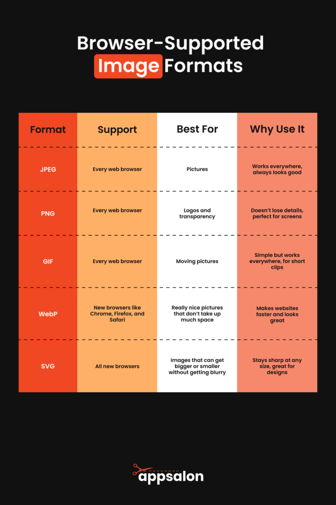
To ensure that website images look great and load quickly across all platforms, including various mobile devices, it’s crucial to understand which image formats are supported by different web browsers. This knowledge can dramatically affect website performance and user experience.
Supported Formats:
- JPEG: A staple on the web, JPEG images are supported by virtually all web browsers, including Chrome, Firefox, Safari, and Edge. They’re reliable for consistent performance across various devices.
- PNG: Known for its lossless compression and transparency support, PNG is also universally supported, making it a great choice for logos and graphics. Plus, PNG files are displayed perfectly on modern browsers and mobile devices, as optimised by services like TinyPNG.
- GIF: While not as versatile due to its limited colour palette, GIFs are supported everywhere and are ideal for simple animations.
- WebP: Although newer, WebP has garnered support from Chrome, Firefox, Edge, and Opera, with Safari adding support in recent updates. It’s becoming a preferred choice for balancing quality and performance.
- SVG: Scalable Vector Graphics (SVG) are supported by all modern browsers and are perfect for icons, logos, and any graphics that need to scale without losing quality.
Optimal Performance Advice:
When optimising images for the web, picking a format that’s supported by the browsers your audience uses is key. To offer the best compatibility and alleviate the load on your web server, consider using a WordPress plugin that optimises images externally on their servers.
For instance, if you’re targeting a broad audience, including those with mobile devices or older browsers, sticking with JPEG and PNG might be the safest bet. However, if analytics show that your users are on modern browsers, using WebP could significantly enhance loading times and improve overall performance. Plus, using server-optimised image handling can prevent performance issues from server-taxing operations.
Bear in mind that adopting next-generation formats like WebP can increase site speed and performance on both mobile devices and desktops, but you should offer fallback options (like JPEG or PNG) to ensure no user is left with broken images due to compatibility issues. It’s also wise to remember that even if your website is running on the best servers, images can still be the downfall of performance. Therefore, consider using FTP options to lessen the load on your web server.
By catering to browser support and implementing smart image optimization strategies, you ensure images on your website look good, load quickly, and contribute positively to user satisfaction and SEO performance.
Top Tools to Compress and Convert Images Quickly
When you’re managing a website, finding tools that simplify the image optimisation process is key. These tools allow you to quickly compress and convert images, ensuring they load fast without sacrificing quality — an essential factor in enhancing blog loading speed. Let’s dive into some top tools that are both user-friendly and effective.
TinyPNG is a fantastic resource that could be likened to a magic wand for digital imagery. As a compressor, it’s a must-have for a streamlined image optimisation strategy. TinyPNG stands out for its straightforward interface which makes JPEG, PNG, and now WebP files lighter without a perceptible loss in quality. Up to 20 images can be compressed simultaneously which is perfect for bulk optimisations. After uploading your images, TinyPNG works its magic, and then you download the optimised versions, which often display file size reductions between 40%-70%.
Top 5 Features:
- Bulk compression – up to 20 images at once.
- Support for PNG, JPEG, and WebP formats — diversity in compression type is catered for.
- Maintained image quality post-compression.
- Simple drag-and-drop interface for ease of use.
- Accessibility without registration for basic compressions.
Benefits:
- Saves server space and bandwidth.
- Enhances website load speed, a critical component of SEO.
- Intuitive interface demands no specific technical skillset.
- Free to use for basic service levels; premium options for more intense needs.
- Speedy optimisation process makes bulk work manageable.
Cons:
- Potential size limitations in the free version could be a bottleneck.
- No customisable compression levels in the complimentary version.
Best for: Web developers and content creators searching for an efficient, straightforward image optimisation tool.
Kraken.io is another robust tool suitable for both individual and bulk image compressions. It steps up the game by offering more involved features like choice in compression type: lossy and lossless modes, allowing precise control over your final image quality and file size.
Top 5 Features:
- Lossy and lossless compression options for flexibility.
- Multiple file format compatibility, catering to diverse needs.
- API for seamless integration into automated workflows.
- Web interface and WordPress plugin for straightforward CMS integration.
- Professional-grade options for those who need them.
Benefits:
- Greater command over compression settings.
- Suited for high-volume projects.
- Direct integration options for platforms like WordPress.
- Quality images with no quality loss through lossless compression.
- Developer-friendly API for advanced applications.
Cons:
- May not be as intuitive for beginners compared to simpler tools like TinyPNG.
- Premium subscription needed for comprehensive feature access.
Best for: Advanced users desiring more control over image compression and professionals handling substantial image databases.
Imagify offers a comprehensive approach, specialising in image optimisation with its WebP conversion prowess, a key factor for blogs aiming for faster loading speeds. Its seamless integration with WordPress makes it a go-to for convenient, automatic optimisation with one-click solutions, efficiently reducing image file size substantially.
Top 5 Features:
- Automatic resizing, compression, and conversion capabilities.
- User-friendly one-click optimisation.
- Bulk optimisation to maximise time-efficiency.
- Seamless WordPress integration, ideal for themed site builders.
- Opportunity to explore features with a free trial.
Benefits:
- Automatic process reduces the time spent on image optimisation.
- Delivers images in WebP for improved speed and quality—key for better user experience.
- Effortless WordPress compatibility, enhancing blog loading speed without hassle.
- Compression type versatility with different levels offered.
- Minimises manual work with timesaving automation.
Cons:
- Limited monthly optimisations for the no-cost plan.
- Some users may be looking for more granular customisability options.
Best for: WordPress end-users and online personas looking to streamline their image optimization process and revel in a hands-off approach.
These digital tools make an impression because they simplify the compression and conversion process drastically. Whether you’re drawn to the user-friendly nature of TinyPNG, the precision offered by Kraken.io, or the automation afforded by Imagify, you’re provided with stellar options to select from. Assess your specific requirements and the number of images you deal with to pinpoint the tool that will serve you best.
The Step-by-Step Guide to Optimising Your Images
Quick Compress Techniques for WebP Images
Quickly compressing WebP images without losing perceptible quality can be accomplished using the right tools and settings. If you’re aiming for a rapid approach, here are some effective techniques to get your WebP files web-ready in no time.
Choose the Right Compression Level: Start by selecting a sensible default compression level. Around 85% quality is a good starting point, as it provides a balance between file size and image quality. This percentage tends to be the sweet spot where your images will look great without taking too long to load. Here, the medium compression rate works wonders, striking a perfect balance between quality and server space economy.
Auto-Compression Services: Using online tools such as Imagify or TinyPNG can speed up the process. These services automatically determine the best compression level for your images, optimising them with minimal effort. Embrace the power of the ‘ultra’ setting for an intense reduction in file size when necessary.
Batch Processing: Many tools offer the ability to compress multiple images at once. This method, known as batch processing, is a real timesaver. Simply upload all your WebP images to the tool of your choice, and it will compress them in one go, applying the chosen compression type consistently and efficiently.
WordPress Plugins: If your website is powered by WordPress, plugins like Imagify can perform on-the-fly compression as you upload images, which means you won’t even have to think about it. These plugins can also convert other image formats to WebP upon upload, streamlining your workflow and providing an automatic solution for file size management.
Using APIs for Automation: For those with development experience, or access to one, using APIs provided by services like TinyPNG can fully automate the process. You can integrate these APIs into your image upload system to compress images as they are saved to your server, giving you control over the compression rate directly in your digital ecosystem.
Setting up a CDN: Content Delivery Networks (CDN) can be configured to serve compressed WebP versions of your images. Modern CDNs can detect the browser’s capabilities and serve WebP images if supported, ensuring both optimisation and compatibility. This takes advantage of the CDN’s efficiency while tailoring the compression type to the needs of the user’s browser.
Use these quick compress techniques to efficiently reduce WebP file sizes, thereby improving your site’s speed and performance. When done properly, users will enjoy faster loading times, and you’ll benefit from improved SEO and increased user satisfaction.
These simple yet powerful techniques prioritise both speed and quality, giving you the best of both worlds in web optimisation. Remember to always check the final output to ensure your images maintain a quality that reflects well on your website, while reveling in the faster load times your optimised WebP images will bring.
The Secret to Compressing JPEG Images Without Losing Quality
Compressing JPEG images without losing perceptible quality hinges on mastering the delicate art of balance. The key is to reduce the file size to speed up page loads while keeping the image looking sharp and professional, even after jpg compression. Here are some secrets to achieving that sweet spot:
Choose the Right Compression Tool:
Using a reputable image editing tool or service like Adobe Photoshop, TinyPNG, or Imagify offers options to adjust the compression level of an image manually. These services use advanced algorithms to ensure minimal loss of quality during compression, which is essential considering Google indexes SVGs the same way it does PNGs and JPGs.
Understand Compression Settings:
Understanding the compression settings is vital. Aim for a compression level between 70-90% for JPEGs, as this usually retains the image’s integrity while decreasing the size considerably. The ability to select the compression type allows for flexibility in managing image quality and file size.
Save for Web:
If you’re using a tool like Adobe Photoshop, utilise the “Save for Web” option. It’s specifically designed to balance image quality with file size efficiency for web use, accommodating different compression types for optimal results.
Progressive JPEGs:
Choose progressive JPEGs over baseline JPEGs. Progressive JPEGs load in waves of increasing detail, making them appear to load faster, improving user experience, especially when images are used as thumbnails on websites.
Selective Compression:
Certain tools allow you to apply more aggressive compression to specific areas of the image that are less noticeable while keeping high-impact areas less compressed. This selective approach can maintain the overall image quality, especially when dealing with JPGs and thumbs that require nuanced optimisation strategies.
Resizing Before Compressing:
Scale down the image dimensions before compressing. Often, images are uploaded to sites at far larger dimensions than necessary. Smaller dimensions naturally reduce the file size, and when combined with compression, lead to faster load times.
Test and Preview:
Always preview the compressed image before making it live on your site. If the image sits alongside text , make sure to check how it looks in the context of the site’s typography and layout, to ensure that the image’s thumb version is still legible and aesthetically pleasing after compression.
The secret to successful JPEG compression is finding a compromise between size and quality that suits your specific needs. With the right tool and a touch of patience, you can ensure your images load quickly and look stunning. Implement these strategies, and you’ll keep your website’s visuals strikingly clear and aesthetically pleasing without burdening your site’s load time, delivering a smooth experience to your visitors.
Additional Image Optimization Strategies
Resizing Images for Faster Load Times
Resizing images is a crucial step in image optimisation that can significantly enhance your website’s load times. Large images take longer to load, which can slow down your entire website, so let’s explore how to effectively resize your images for a snappier performance.
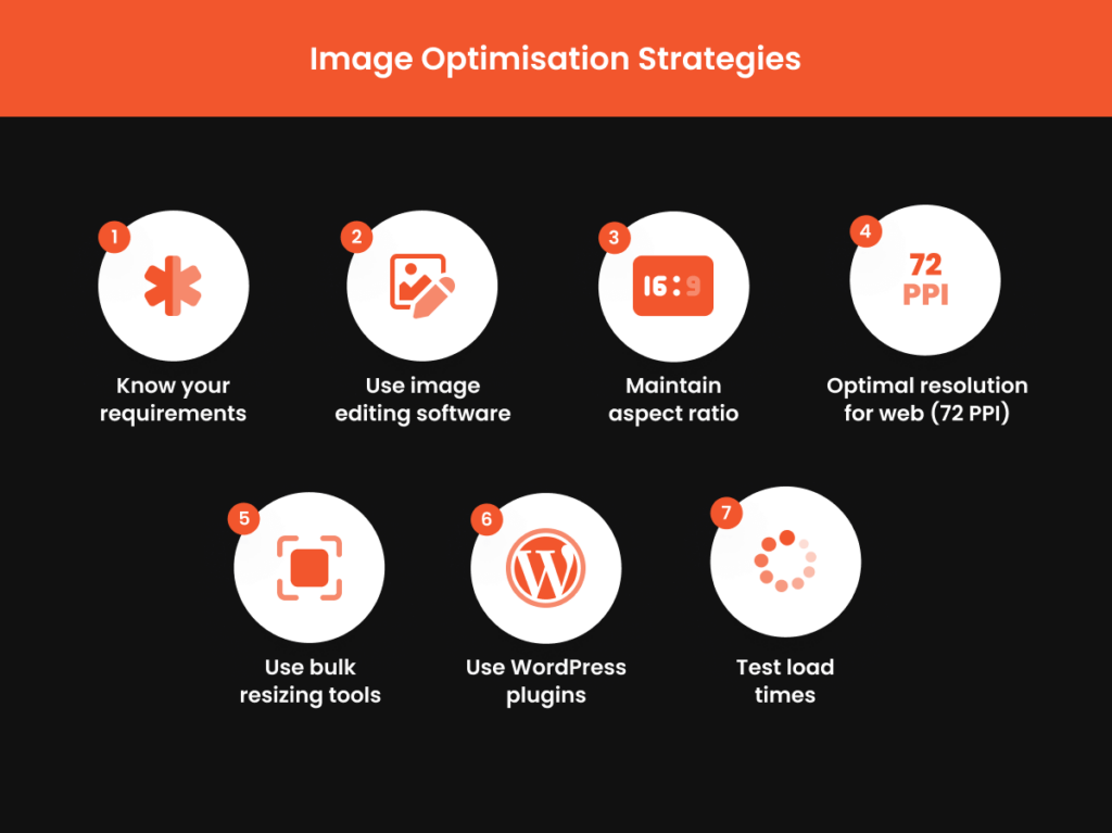
Understand Your Requirements:
First, determine the maximum image size you actually need on your site. Consider the width of your images in relation to the container element on your webpage — there’s no need for an image to exceed this width, as it only contributes to excess byte usage without any visible gain.
Use Image Editing Software:
Popular tools like Adobe Photoshop, GIMP, or even simple programs like Microsoft Paint allow you to adjust the dimensions of your images. Canva and Pixlr are also great online alternatives for quick resizing jobs. When resizing, keep an eye on the image file’s metadata, which might change and can affect how the image is indexed and displayed online.
Maintain Aspect Ratio:
Maintain the aspect ratio to avoid stretching or squishing the image. This keeps your images looking natural and professional after resizing, and ensures they fit perfectly in your site design without unnecessary disk space consumption.
Optimal Resolution for Websites:
Web images don’t need to be in high resolution. A resolution of 72 pixels per inch (PPI) is typically sufficient for screens and aids in faster loading times, as it reduces the time to first byte when your site calls the image to load.
Bulk Resizing Tools:
For multiple images, consider tools that support batch resizing, like IrfanView or Light Image Resizer. These can save you a lot of time by resizing a large number of images simultaneously, thus effectively managing your site’s disk space.
WordPress Plugins:
If using WordPress, plugins like WP Smush or ShortPixel can automatically resize images upon upload, optimising them for the necessary width, maintaining metadata coherence, and further conserving disk space.
Testing Load Times:
After resizing, use tools like Google PageSpeed Insights, GTmetrix, or Pingdom to test the impact on your site’s load times. This will help you gauge the effectiveness of your image resizing.
By resizing your images before uploading them to your website, you help ensure your pages load quickly, leading to improved SEO, lower bounce rates, and a better overall user experience.
Remember, smaller file sizes translate to faster load times, and a faster website creates happy users and boosts your site’s performance on search engines.
Automating Image Optimization with WordPress Plugins
Automating the process of image optimisation is a game-changer, especially if you’re using WordPress. By leveraging dedicated plugins, such as the AVADA SEO: Image Optimizer, you can execute optimisation seamlessly behind the scenes, which is crucial for maintaining your ecommerce site’s speed and performance. Here are some pointers on how to incorporate this into your workflow:
Understand the Benefits:
An image optimisation plugin automatically compresses and resizes images when they’re uploaded, saving time and ensuring your ecommerce photography setup is used effectively. Consistency in image optimisation efforts is crucial for user experience in portfolios and beyond.
Choose a Suitable Plugin:
Evaluate the top apps and plugins like EWWW Image Optimizer Cloud, Imagify, and WP Smush against your ecommerce site’s specific needs — be it cost or image volume — and whether you require bulk optimisation.
Top 5 Features to Look For in a Plugin:
- Auto-resize and compress upon upload.
- Bulk optimisation for existing images.
- Lossy and lossless compression options.
- Support for multiple file formats, including WebP.
- Compatibility with other WordPress plugins and themes, which is essential for a seamless workflow if you’re running an ecommerce blog or portfolio site.
Plugin Setup:
After choosing a plugin, its installation is typically straightforward. The built-in setup wizards handhold you through compression and resizing configurations to align with your ecommerce requirements.
Monitor Performance:
Keep an eye on your site’s speed before and after plugin installation using tools like Google PageSpeed Insights. This is key in an ecommerce context, as page load speed, affected by too many apps, could deter customers, potentially harming sales.
Ongoing Management:
Employ the bulk optimisation feature offered by many plugins to update your existing image portfolio, ensuring all content meets current standards for an optimised ecommerce experience.
In conclusion, automated image optimisation with WordPress plugins can lead to significant performance improvements. As a result, this will not only enhance your website’s efficiency but can also improve your search engine rankings, driving more traffic to your ecommerce site. Whether you’re managing a personal blog or a thriving ecommerce site, these tools are invaluable for streamlining your content management tasks and keeping your site agile in a competitive digital landscape.
Why Prioritise Image Optimisation for Your Website?
The Direct Impact on Site Speed and User Experience
The optimisation of website images, particularly through compression and proper formatting, directly impacts site speed and user experience. Faster loading times not only enhance user satisfaction as they navigate through your site, lending to better accessibility, but here’s how it all connects:
User Perception and Interaction:
Studies have found that users notice delays as small as 1/10th of a second. When your images load quickly, users are more likely to view your site as professional and reliable. Quick load times also reduce the chance for users to become impatient and leave. This is crucial for engaging users on any device, especially on a mobile device where screen real estate and attention spans are limited, directly influencing clicks and conversions.
You can read more in our blog post: Speed Up Your Site: Essential Tips On How To Improve Website Page Speed.
Search Engine Ranking:
Search engines, like Google, have indicated that site speed is a ranking factor. Faster websites provide a better user experience, prompting search engines to favour them in search results. Optimized images play a significant role in achieving speedy load times crucial for SEO and generating more clicks. As a result, with just a few clicks into your site’s settings to enable features like automatic image optimisation, you can potentially boost your search rankings.
Mobile Experience:
With increasing mobile internet access, optimised images have an even greater impact. Mobile users often face data constraints and slower connections, thereby making optimised images a must for providing a smooth, accessible experience for all users.
By focusing on image optimisation, you’re not just improving technical metrics; you’re enhancing the real, perceived experience of everyone who visits your site. Prioritising image optimisation is not just a best practice but a necessity for a competitive online presence, directly contributing to conversions and user retention through improved interactions.
Enhancing SEO through Optimised Images
Optimised images are an invaluable asset in your SEO strategy. With the right application of metadata, the effectiveness of visuals can be significantly amplified. By ensuring that your images’ metadata is consistent with your optimised image file name, page title, and URL structure, you enhance its capability to work in tandem with your on-page SEO. When you fine-tune your website’s visuals, you’re not just facilitating a more enjoyable user experience — you’re also making your site more discoverable amidst the endless sea of online content.
Here are ways that image optimisation bolsters your SEO:
- Faster Load Times: Search engines favour websites that load quickly, as fast load times are a signal of a good user experience. Compressed and properly formatted images are smaller in file size, leading to quicker page load speeds and better search rankings. Keep in mind that well-optimised images can vastly reduce a webpage’s weight, enhancing load time as HTTP Archive suggests.
- Improved User Engagement: Visitors engage more with websites that have a fast and responsive user experience, leading to signals that search engines interpret positively, like longer dwell times and lower bounce rates.
- Alt Tags & Descriptions: Including accurate image alt text with descriptive, keyword-rich alt tags for your images is crucial since search engines can better understand the content, allowing your images to feature more prominently in relevant search queries.
- Structured Data: Implementing structured data for your images can signal to Google more details about the content, such as creator information, licensing, and more, potentially increasing visibility in Google Images.
- Mobile Optimisation: Optimised images ensure that your site loads well on mobiles, which is key as Google progressively shifts toward mobile-first indexing.
Tips to Further Enhance SEO with Images:
- Rename image files to include relevant keywords before uploading.
- Use responsive images with the srcset attribute to serve different sizes based on the user’s device.
- Create an image sitemap or add images to your existing sitemap to aid search engines in discovering all the media.
Advanced Tips for Professionals
Making Use of Content Delivery Networks (CDNs) for Image Hosting
Employing a Content Delivery Network (CDN) for hosting your website’s images is an advanced optimization step with significant benefits for your site’s speed and performance. A CDN stores your images on multiple servers around the world, reducing the distance data must travel to reach your users and speeding up load times as a result.
How CDNs Enhance Image Delivery:
- Reduced Latency: By hosting images closer to the user, CDNs minimise the time it takes for these images to be delivered, resulting in faster page loads.
- High Availability: CDNs often include failover protection, meaning if one server goes down, another can take its place, ensuring your images are always available.
- Scalability: CDNs can handle sudden surges in traffic without compromising on performance, which is essential for maintaining a good user experience during peak periods.
- Bandwidth Savings: CDNs can reduce the bandwidth strain on your primary server by offloading image delivery, often leading to cost savings in hosting.
Shopify merchants can rest easy as Shopify provides its own CDN, simplifying the process for its users. However, those using other platforms should give serious consideration to integrating a CDN. Popular CDN services include Cloudflare, Amazon CloudFront, and Akamai.
Best Practices When Using CDNs for Image Hosting:
- SEO Considerations: Be mindful that if images are hosted on a different domain via a CDN, it could impact backlink attribution. Ensure that the CDN is properly configured to credit your website.
- Caching Policies: Implement and manage appropriate caching policies on the CDN to ensure that images are stored efficiently without being outdated.
- Load Testing: Periodically test your CDN’s performance to ensure it meets the demands of your site and delivers the expected speed enhancements.
- HTTPS Support: Ensure that the CDN offers HTTPS to maintain security standards and user trust, especially if you’re handling sensitive data.
While CDNs are an excellent resource for handling images and other media files, weigh the benefits against your site’s specific needs. For high-traffic sites or those with a global audience, a CDN is almost a necessity. It improves load speeds, helps with bandwidth issues, and can provide a better experience for your users.
Conversely, if your site has a smaller audience or is just starting, your current hosting may adequately handle your needs without the additional complexity and cost of a CDN.
Ultimately, if you decide to integrate a CDN, ensure you have professional help to strategise and implement your move effectively, making the most out of this powerful tool for site optimization.
Implementing Lazy Loading to Further Boost Performance
Lazy loading is a performance optimization technique that loads images on your website only as they are about to enter the viewer’s screen. This means that as a user scrolls through your site, images are loaded progressively, reducing initial page load time, page weight, and system resource usage.
How Lazy Loading Works:
- Initial Load: When a user first visits a page, only the images within the viewport are loaded.
- On Scroll: As the user scrolls down, images begin loading just before they come into view.
- Placeholder Images: Before loading the full image, a lightweight placeholder can be shown to maintain layout structure.
Advantages of Lazy Loading:
- Improved Performance: Lessens the immediate burden on the network by deferring the loading of off-screen images.
- Reduced Bandwidth: Saves bandwidth for both the user and server, particularly for users who don’t scroll through the entire page.
- Enhanced User Experience: By focusing resources on content that the user is actively engaged with, the perceived load time of the site is faster.
To implement lazy loading on WordPress, you can use plugins such as a3 Lazy Load or WP Rocket. Shopify users can find themes that have lazy loading built-in or implement it with custom code.
Considerations When Using Lazy Loading:
- SEO Impact: Ensure that search engines can still crawl your images – use a method that’s recognised by Google, and don’t lazy load images that are crucial to your SEO.
- User Experience: Make sure that lazy loading doesn’t become a distraction; it should be seamless enough that users don’t notice it’s happening.
Lazy loading should be part of a broader optimization approach that includes compressing and resizing images, and using correct formats like WebP or JPEG. When implemented correctly, adding lazy loading to your optimization toolkit can lead to faster, more responsive sites that keep your users happy and engaged.
Frequently asked questions
What is the best image optimizer?
The best image optimizer depends on your specific needs, such as the level of compression, image formats you use, and whether you prefer a web-based tool or a WordPress plugin. However, TinyPNG is highly regarded for its ease of use and effective compression for both PNG and JPEG images, and it also supports WebP format. For WordPress users, plugins like Imagify offer automated optimization, which is incredibly efficient for ongoing website management.
Is it safe to compress images?
Yes, it’s safe to compress images. Image compression reduces file size, which can speed up website load times without affecting the safety of your content. Nonetheless, it’s essential to use reputable tools and maintain backups of your original images before compression in case you need to make adjustments or restore them in the future.
What are image optimization techniques?
Image optimization techniques encompass various methods to reduce file size while maintaining quality, including:
- Compressing images to reduce their file size without significantly impacting visual quality.
- Resizing images to their display size to reduce unnecessary pixel data.
- Using the appropriate file format (JPEG, PNG, WebP) for the type of image.
- Implementing lazy loading to defer off-screen images.
- Utilising CDNs to serve images faster across different geographical locations.
- Leveraging browser caching to store images in the visitor’s cache for faster subsequent load times.
How do I optimize a JPEG for the web?
To optimize a JPEG for the web, follow these steps:
- Resize the image to the dimensions needed on your website.
- Use a tool like Adobe Photoshop to adjust the ‘Save for Web’ quality settings, aiming for a balance between image clarity and file size.
- Consider the use of progressive JPEGs for a smoother loading experience.
- Ensure you select a low resolution of 72 pixels per inch for web use.
- Test the final image on your website to ensure it meets your quality standards while contributing to faster load times.

Submit An App
Seen a cool app you think we should review? Submit your recommendation using our form.